Resisting the Whispers of a Form‑Engine
When building the registration section of our apps, many of us will have heard that seductive whisper:
"These fields are so alike. You should generalise them. Let's build a form-engine"
It makes sense. The fields are alike. Why shouldn't you build a form-engine? You'd be praised by the rest of the team. You'd be easing the burden of any future developers. You'd be adding value 😇.
So you go away and build that form-engine that lets you assemble form pages in minutes. No sooner have you pushed this masterpiece in declarative programming to main than you're pulled onto another feature. Your colleague picks up registration and, moments after opening their Xcode, you hear their cry of frustration: trying to customise the password field, they discover your form-engine has buried the actual SecureField inside a view shared by five screens and surrounded by a mountain of if statements. An isolated, simple change has become a risky, regression-prone slog.
As you peek round from behind the coffee machine, you hear that whisper again, but this time it isn't seductive. This time, you hear the malice in it as it mocks you for falling into the form-engine trap 😈.

The instinct behind a form-engine is good: capture a common pattern in a reusable component. Where form-engines fall short is in being too ambitious. They go too far and end up creating a quasi-Domain-Specific Language (DSL) that doesn't complement SwiftUI — it tries to replace it. Creating your own language is hard. Creating one accidentally is harder. Maintaining it? Hardest of all. Especially when the creator doesn't control the ideas that form the bedrock of this DSL masquerading as a form-engine.
One day, a designer comes along - unaware that this form-engine exists - and asks for a small behaviour change on one screen: a password field should shake on error. The form-engine creator now must either add more conditionals to the abstraction or split it. Conditional wins at first, and they find a way to trickle that shake behaviour down to the input field. Then the designer changes the border colour. Then the font. Then adds a description label. And so on.
Before the form-engine creator knows it, that trickle has become a flood. The complexity has skyrocketed, and now screens are having to opt out of functionality that, without the form-engine, they wouldn't even know about. All those conditionals need tests, and each new conditional only makes testing harder - ending up with more risk, more work, and a codebase that's harder to teach to new developers.
You might be thinking:
"The form-engine creator should just create a new view type to decouple that generalisation"
But that's where they started before the abstraction spiral began. The issue isn't abstraction - it's the ambition to build on ideas that the developer doesn't control. What looks like "the same field" to the developer is "five different concepts" to the designer.
This post will explore how we can get up to the edge of a form-engine and reap the benefits that abstraction can give us without falling into that deep water. Each component we build will handle one concern. Each screen will then be free to use them as needed without becoming overly coupled to any other screen. We'll focus on a single example - a view that handles text entry and validation - but the pattern shown will work for other types of field too.
This post will gradually build up to a working example. But I get it, that whisper is demanding, so if you are unable to ignore it, then head on over to the completed example and take a look at
ValidationInputField,ValidatorandValidationViewModelto see how things end up.
Looking at What We Need to Build
Before jumping into building each component, let's take a moment to look at the overall architecture we're going to put in place and how each component fits into it.
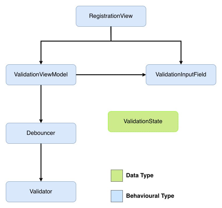
RegistrationViewis the view that controls the screen we are going to add our input field to (we will only cover this briefly to see howValidationInputFieldcan be used).ValidationInputFieldis our input field view. It will allow us to share common functionality across different screens.ValidationViewModelorchestrates validation, debouncing, and state exposure to the UI. There are a number of ways we could connect the outcome of validating to the view. In the example project for this post,MVVMis the architecture chosen, with theViewModelacting as that connector. But as you will see,MVVMisn't intrinsic to this solution and you should be able to swap in whatever controller you want here.Debouncerhelps smooth out the validation feedback by waiting for the user to stop typing before triggering validation.Validatorperforms validation on the user's input.ValidationStaterepresents the outcome of the validation in a declarative manner that the view can consume.
Don't worry if that doesn't all make sense yet; we will look into each component in greater depth below.
Now that we know where we are going, let's start by implementing password validation as a concrete solution, then we'll take that solution and abstract it to validate any input.
This project is built using Swift 6.2 with the
Default Actor Isolationbuild setting set toMainActor. If you need to support an earlier version of Swift or don't want to setDefault Actor IsolationtoMainActor, then add@MainActorwhere needed.
Defining What Makes a Valid Password
Before we can validate anything, we need a validator. That validator will answer just one question:
"Is this input acceptable?"
At its most simple, the answer is either true or false.
Let's look at the steps involved in validating a password. First, we need to define the rules for what a valid password is:
- Must have at least 8 characters.
- Must have at most 24 characters.
- Must have at least one lowercase character.
- Must have at least one uppercase character.
- Must have at least one number.
With this definition, let's implement a validator that enforces those rules:
struct PasswordValidator {

    // 1
    func validate(_ value: String) -> Bool {

        // 2

        // Must have at least 8 characters
        guard value.count >= 8 else {
            return false
        }

        // Must have at most 24 characters
        guard value.count <= 24 else {
            return false
        }

        // Must have at least one lowercase character
        guard value.contains(where: { $0.isLowercase }) else {
            return false
        }

        // Must have at least one uppercase character
        guard value.contains(where: { $0.isUppercase }) else {
            return false
        }

        // Must have at least one number
        guard value.contains(where: { $0.isNumber }) else {
            return false
        }

        return true
    }
}
Here's what we did:
PasswordValidatorhas one methodvalidate(_:) -> Boolthat takes aStringargument and returnstrueif that argument constitutes a valid password orfalsefor an invalid password.valueis checked against each rule. If a check fails,falseis immediately returned. If all checks pass,trueis returned.
In this post, all validation happens locally. If you need validation that involves asynchronous work, you could make this into an asynchronous method, e.g.
func validate(_ value: String) async -> Bool.
PasswordValidator in its present form is a perfectly good validator, but notice how we lose details during the validation process - we know on which rule validation fails, but that information is lost by returning the same value for each validation failure. Let's tweak PasswordValidator to preserve that information by having PasswordValidator throw an error rather than return a boolean. Before PasswordValidator can be changed, we first need to define what errors can be thrown:
enum PasswordValidationError: Error {
    case tooShort
    case tooLong
    case missingLowercase
    case missingUppercase
    case missingNumber
}
PasswordValidationError is an enum that conforms to Error. Each case corresponds to one of the validation rules defined above. Let's update PasswordValidator to throw a PasswordValidationError error when the input is invalid:
struct PasswordValidator {

    // 1
    func validate(_ value: String) throws {

        // Must have at least 8 characters
        guard value.count >= 8 else {
            throw .tooShort
        }

        // Must have at most 24 characters
        guard value.count <= 24 else {
            throw .tooLong
        }

        // Must have at least one lowercase character
        guard value.contains(where: { $0.isLowercase }) else {
            throw .missingLowercase
        }

        // Must have at least one uppercase character
        guard value.contains(where: { $0.isUppercase }) else {
            throw .missingUppercase
        }

        // Must have at least one number
        guard value.contains(where: { $0.isNumber }) else {
            throw .missingNumber
        }
    }
}
Here's what we did:
- Instead of using a
Boolas the return type, we instead either throw an error for invalid input or return nothing at all for valid input. By throwing a unique error for each failure, any type making use of this validator will be able to tailor their response to what exactly went wrong.
PasswordValidator now throws specific errors for each rule it enforces. Which is good, but we can take it a step further. At present even though PasswordValidator only throws PasswordValidationError, the compiler requires us to handle unrelated error types as well because as far as the compiler is concerned, that plain throws that we added to validate(_:) effectively means "this method can throw any Error" so we need to handle any Error in our do-catch blocks. As validate(_:) will always throw PasswordValidationError, this error handling for any Error is effectively dead/unreachable code. We can give the compiler more information about the errors validate(_:) can throw, and so avoid that dead code by using: typed throws.
Typed throws allows us to declare exactly which error type a method throws. By eliminating error erasure, our validation chain can be fully type-safe. To take advantage of this, let's update PasswordValidator to specify that it only throws PasswordValidationError errors:
struct PasswordValidator {

    // 1
    func validate(_ value: String) throws(PasswordValidationError) {
        // Omitted method body as it is unchanged
    }
}
Here's what we did:
- As
validate(_:) throwsalready only ever throwsPasswordValidationError, we only need to change the signature to use typed throws.
Notice what PasswordValidator doesn't know: it doesn't know about views, debouncing, or user feedback. It knows password rules - that's it. This single responsibility makes it reusable across any context that needs password validation: registration, settings, password reset, wherever. This is the first piece of our separation of concerns: validators validate, nothing more.
With password validation implemented, let's figure out how to share the outcome of that validation in a way that fits the needs of a declarative UI.
Transforming Outcomes
SwiftUI views excel when they react to state rather than handle control flow. Currently, PasswordValidator throws errors, which would force any consuming view into imperative error handling with do-catch blocks. Mixing imperative code in declarative spaces creates awkward code. Instead, we can introduce an enum for representing validation outcomes as observable state that a SwiftUI view can render declaratively. This enum will act as a clean boundary between the two styles:
// 1
enum ValidationState: Equatable {
    case valid
    case invalid(String)
}
Here's what we did:
ValidationStatehas two cases:.validand.invalid, representing the successful and unsuccessful validation outcomes..invalidhas an associated value of typeStringthat will be used to hold a user-friendly message for why their input failed validation.
Now that we can represent validation outcomes declaratively, let's look at how to transform the output of PasswordValidator into something our custom input field can consume.
Connecting the Validator and Input Field
We now have two pieces that don't quite fit together: PasswordValidator throws errors, but we've said that our custom input field needs ValidationState to render. We need something to bridge this gap.
That's the role of PasswordViewModel. It acts as the coordinator between these components, handling three key responsibilities:
- Publishing - enabling
PasswordInputFieldto react to state changes. - Triggering validation - when the user's input changes
- Bridging the gap between our validator and the UI - catching and transforming validation errors into
ValidationState
SwiftUI views automatically re-render when the state they observe changes. To enable this reactive behaviour, we need to mark PasswordViewModel with @Observable:
@Observable
final class PasswordViewModel {
}
@Observable automatically makes all properties observable, allowing SwiftUI to track changes and update the UI accordingly.
If your app needs to support pre-iOS 17, you can substitute in
Combineto get the reactive behaviour provided by@Observable.
With the reactive foundation in place, we now need to decide what state to hold:
value- the current input.validationState- the validation outcome.
Let's start with value:
@Observable
final class PasswordViewModel {
   // 1
   var value: String

   // 2
   init(initialValue: String) {
      self.value = initialValue
   }
}
Here's what we did:
- Created a
valueproperty that will be bound to its associated view. - Implemented the initialiser to accept the initial value of
value.
Before adding validationState, we need to decide its initial value. The current choices of valid and invalid don't feel right, as neither represents the nature of validation when no validation has occurred on value. We are missing a third ValidationState case - .unchanged to represent this unvalidated state. Let's add that:
enum ValidationState: Equatable {
    case unchanged
    case valid
    case invalid(String)
}
With .unchanged, we can now add a property to PasswordViewModel that can be used to drive any view changes based on the outcome of validation:
@Observable
final class PasswordViewModel {
    // Omitted unchanged properties

    // 1
    private(set) var validationState: ValidationState = .unchanged

    // Omitted unchanged methods
}
Here's what we did:
- Added a
validationStateproperty to share the outcome of validation. Unlikevalue, we don't want anything external toPasswordViewModelto be able to set this property, so we mark it asprivate(set)to allow read but not write access.
Before we can trigger validation, we need to get from the PasswordValidationError that validator outputs to a String that the .invalid case of ValidationState expects. There are many ways to do this; here, we are going to extend PasswordValidationError to conform to LocalizedError and use errorDescription to do the conversion:
// 1
extension PasswordValidationError: LocalizedError {

    // 2
    var errorDescription: String? {
        switch self {
        case .tooShort:
            return "Password must be at least 8 characters long."
        case .tooLong:
            return "Password must be at most 24 characters long."
        case .missingLowercase:
            return "Password must contain at least one lowercase letter."
        case .missingUppercase:
            return "Password must contain at least one uppercase letter."
        case .missingNumber:
            return "Password must contain at least one number."
        }
    }
}
Here's what we did:
- Created an extension that conforms
PasswordValidationErrortoLocalizedError. - Implemented the property
errorDescriptionofLocalizedErrorto provide a user-friendly description for each error.
LocalizedErrordefines several other properties; we don't need to make use of them here, so I've not implemented them.
Now that we have validationState and a way to convert PasswordValidationError to String, we have everything we need to validate:
@Observable
final class PasswordViewModel {
    // Omitted unchanged property

    // 1
    private let validator: PasswordValidator

    init(initialValue: String,
         validator: PasswordValidator) {
        // Omitted unchanged code

        self.validator = validator
    }

    // 2
    func validate(_ currentValue: String) {
        do {
            try validator.validate(currentValue)

            // 3
            validationState = .valid
        } catch {
          // 4
          let errorMessage = error.errorDescription ?? "Unknown error"

          validationState = .invalid(errorMessage)
        }
    }
}
Here's what we did:
- Added a private
validatorproperty to hold theValidatorinstance that will be used during validation. - Implemented
validate(_:)to trigger validation. Asvalidate(_:)onValidatorcan throw, we wrap that call in ado-catchblock. - When validation succeeds, we set
validationStateto.valid. - As
PasswordValidationErrornow conforms toLocalizedError, we callerrorDescriptionto get the user-friendly message we defined. As this is an optional property, we need to provide a default error message in casenilis returned. We setvalidationStateto.invalid.
PasswordViewModel can validate, but we aren't triggering that validation. There are two options:
- Property side-effect - trigger validation automatically whenever
valuechanges. - Explicit method call - call
validate(_:)fromonChange(of:initial:_:)in the view.
We are going with the property side-effect approach here. This approach keeps decision-making out of the view layer, and while property side-effects are often discouraged because they hide behaviour, this case is different: we want validationState to always be in sync with value. These aren't separate concerns - they're two facets of the same state. By triggering validation in didSet, we maintain this invariant automatically rather than relying on the view to remember to call validate(_:). This keeps coordination logic where it belongs - in the view model, not scattered across views.
@Observable
final class PasswordViewModel {
    var value: String {
        // 1
        didSet {
            validate(value)
        }
    }

    // 2
    private func validate(_ currentValue: String) {
        // Omitted unchanged code
    }
}
Here's what we did:
- Updated
valueso that any change will trigger validation to occur. - Updated
validate(_:)to now beprivate.
While this is all that is required for our view model to trigger validation and convert the outcome of that validation into something PasswordInputField could consume, there is a subtle behavioural quirk: reverting value back to its initial state won't reset validationState back to .unchanged. This means that the same value might sometimes be treated as an error and sometimes not. Let's correct this:
@Observable
final class PasswordViewModel{
    var value: String {
        didSet {
            // 1
            guard value != initialValue else {
                validationState = .unchanged

                return
            }

            // Omitted unchanged code
        }
    }

    // Omitted other properties

    // 2
    private let initialValue: String

    // 3
    init(initialValue: String,
         validator: PasswordValidator) {
        // Omitted unchanged code

        self.initialValue = initialValue
    }

    // Omitted other methods
}
Here's what we did:
- To avoid validating the initial value of
value, we check that the current value is different frominitialValue- we don't want to treat the initial value ofvalueas an error even if it actually is. - Added an
initialValueproperty to allow the current value ofvalueto be compared against its initial value. - Updated the initialiser to set the
initialValueproperty.
PasswordViewModel is now complete - it coordinates validation without knowing about text fields, and it manages state without knowing validation rules. Each piece stays focused. Let's build the next piece: PasswordInputField.
Creating a Password Input Field
Before we can begin writing a validating input field, we first need to know what our form field should look like:
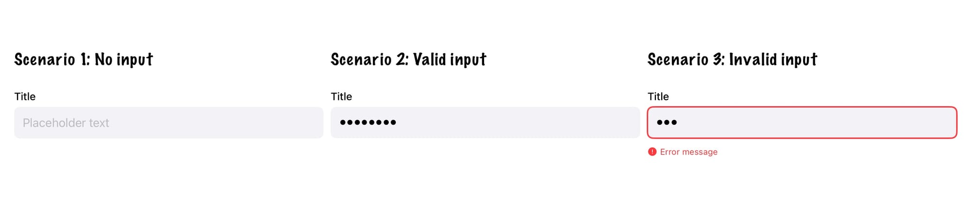
Across the three different scenarios shown in the mock-up, the input view consists of:
- Title Label - describes what information the user needs to enter.
- Input Field - allows the user to enter the requested information.
- Error Label - describes how the entered information is invalid.
Now we know what to build - we need to think about how we should design its API.
When creating reusable views, one goal is to give that view a clean, focused initialiser. SwiftUI's own SecureField demonstrates this beautifully: its initialiser accepts only the essential state needed to render the field, with styling and behaviour added through view modifiers.
Let's follow that pattern.
Looking at the mock-up, the title and input field are always present, so we want to pass the state used to set these via the initialiser, but the error label is conditional - we'll add that state via a modifier later. For now, the initialiser needs:
struct PasswordInputField: View {
    private let placeholder: String
    private let title: String
    @Binding private var value: String

    // 1
    init(title: String,
         placeholder: String,
         value: Binding) {
        self.placeholder = placeholder
        self.title = title
        self._value = value
    }

    // 2
    private var titleView: some View {
        Text(title)
            .font(.subheadline)
            .fontWeight(.medium)
            .foregroundColor(.primary)
    }

    // 3
    private var inputView: some View {
        SecureField(placeholder,
                    text: $value)
        .padding(12)
        .background(Color(.systemGray6))
        .cornerRadius(8)
    }

    // 4
    var body: some View {
        VStack(alignment: .leading,
               spacing: 0) {
            titleView
                .padding(.bottom, 6)

            inputView
                .padding(.bottom, 12)
        }
    }
}
Here's what we did:
PasswordInputField's initialiser takes three arguments:title(text for the title label),placeholder(text shown when empty), andvalue(stores user input). The first two are simpleStringvalues thatPasswordInputFieldonly reads. Butvalueis different - the input field needs to both read the current value and write changes back. That's whatBindingprovides: a two-way connection that lets changes flow from the text field back to the view model, ensuring the user's input isn't lost.- Implemented the title label as the
titleViewproperty. - Implemented the input field as the
inputViewproperty. - Arranged the subviews in a vertical stack within
bodyto match the mock-up.
Let's add our PasswordInputField to RegistrationView to capture the user's password:
struct RegistrationView: View {
    @Bindable var viewModel = PasswordViewModel(initialValue: "",
                                                validator: PasswordValidator())

    var body: some View {
        passwordFieldView
    }

    private var passwordFieldView: some View {
        PasswordInputField(title: "Enter your password",
                          placeholder: "Enter your password",
                          value: $viewModel.value)
        .textContentType(.newPassword)
    }
}
While PasswordInputField looks good, it's purely presentational - no validation yet. Let's layer validation in by connecting it to our view model's state.
SwiftUI uses environment values for configuration that should cascade down the view hierarchy - think .font(), .foregroundColor(), or .disabled(). Validation state fits this pattern perfectly: it's set at the parent level and consumed by nested input fields. Let's add validationState to the environment:
// 1
extension EnvironmentValues {
    @Entry var validationState: ValidationState = .unchanged
}

// 2
extension View {
    func validationState(_ value: ValidationState) -> some View {
        environment(\.validationState, value)
    }
}
Here's what we did:
- Extended
EnvironmentValueswith avalidationStateproperty, making it available throughout the view hierarchy like built-in environment values. - Created a convenience modifier that lets us write
.validationState(value)instead of the more verbose.environment(\.validationState, value).
With these changes, we can now pass validation state into the field:
struct RegistrationView: View {
    // Omitted unchanged code

    private var passwordFieldView: some View {
        PasswordInputField(title: "Enter your password",
                           placeholder: "Enter your password",
                           value: $viewModel.value)
        .textContentType(.newPassword)

        // 1
        .validationState(viewModel.validationState)
    }
}
Here's what we did:
- Passed the
validationStatefrom the view model into the view.
Before updating PasswordInputField to respond to validationState changes, let's add a convenience property to ValidationState to make writing that code easier:
enum ValidationState: Equatable {
    // Omitted cases

    // 1
    var isInvalid: Bool {
        guard case .invalid(_) = self else {
            return false
        }

        return true
    }
}
Here's what we did:
- Added an
isInvalidhelper to check if the current state is.invalid.
Armed with this convenience property, let's make PasswordInputField respond to validation changes:
struct PasswordInputField: View {
    // 1
    @Environment(\.validationState) private var validationState

    // Omitted unchanged methods and properties

    // 2
    @ViewBuilder
    private var validatedView: some View {
        if case let .invalid(errorMessage) = validationState {
            HStack(alignment: .top, spacing: 4) {
                Image(systemName: "exclamationmark.circle.fill")
                    .font(.caption)
                Text(errorMessage)
                    .font(.caption)
            }
            .foregroundColor(.red)
        }
    }

    @ViewBuilder
    private var inputView: some View {
        // Omitted unchanged code

        // 3
        .overlay(
            RoundedRectangle(cornerRadius: 8)
                .stroke(validationState.isInvalid ? Color.red : Color.clear, lineWidth: 2)
        )
    }

    var body: some View {
        VStack(alignment: .leading,
               spacing: 0) {
            titleView
                .padding(.bottom, 6)

            inputView
                .padding(.bottom, 12)

            // 4
            validatedView
        }
    }
}
Here's what we did:
- Added a
validationStateproperty to read from SwiftUI's environment. - Created
validatedViewto display error messages when validation fails. This view only appears when the state is.invalid. - Added a red border to the input field when
validationStateis.invalid; otherwise, the border is clear. - Integrated
validatedViewinto the layout below the existing views.
Before moving on, let's pause on an important design principle. PasswordInputField contains conditional logic - checking validation state, showing errors conditionally. So what separates healthy abstraction from the form-engine trap? The answer lies in shared behaviour vs screen-specific dialects.
The conditionals here - showing an error message, adding a red border - are shared: every screen using PasswordInputField gets the same error display. The field responds consistently to whatever ValidationState it receives. That's healthy abstraction.
The form-engine trap happens when conditionals create unshared behaviour: "if this is the registration screen, shake on error; if it's the settings screen, don't shake; if it's the profile screen, show a tooltip instead." Now we'd have three different dialects of the same component, each screen opting in or out of features. At that point, we'd be better off creating separate components rather than bloating one component with conditionals that only some screens use.
The line is simple: if conditional logic applies to all uses of a component, it belongs in the component. If it's specific to one or two screens, those screens should either decorate this component, use a different component or handle it themselves.
This distinction will guide us as we come to generalise this solution.
If you run the app and try entering an invalid password, you'll see the error message appear below the field as expected.
But you'll also notice something off: the error appears immediately as you start typing. That's not a great user experience 😔.
To smooth this out, we need a helper that waits for a pause in typing before triggering validation. That's where Debouncer comes in.
Debouncing Validation
Looking back at our solution, PasswordViewModel triggers validation in didSet whenever value changes - which means every keystroke. That's what causes the immediate error feedback we just saw.
We need to insert a delay between user-typed and validation-runs. This is debouncing: waiting for a pause in activity before taking action. Instead of validating on every keystroke, we'll wait until the user stops typing for a moment.
SwiftUI doesn't provide a debouncer out of the box, so we'll implement a simple version using Task:
final class Debouncer {

    // 1
    private let delay: Duration

    // 2
    private var task: Task?

    init(delay: Duration) {
        self.delay = delay
    }

    // 3
    func submit(_ action: @escaping () async -> Void) {
        task?.cancel()
        task = Task {
            try? await Task.sleep(for: delay)

            // 4
            guard !Task.isCancelled else {
                return
            }

            await action()
        }
    }
}
Here's what we did:
- Added a
delayproperty to store how long operations wait before executing. - Added a
taskproperty to store the currently delayed operation and enable cancellation. - Implemented
submit(_:)to handle incoming operations. Each call cancels any existing task (preventing stale operations), waits for the specified delay, and then executes the operation - this "cancel and restart" behaviour is what makes debouncing work. - Added a cancellation check before executing the operation. Task cancellation in Swift is cooperative, so merely calling
cancel()won't automatically stop its execution - we must explicitly checkisCancelledto respect the cancellation.
Now that we have Debouncer, let's make use of it:
final class PasswordViewModel {
    var value: String {
        didSet {
            // Omitted unchanged code

            // 1
            debouncer.submit {
                self.validate(self.value)
            }
        }
    }

    // 2
    private let debouncer: Debouncer

    // 3
    init(initialValue: String,
         validator: PasswordValidator,
         debouncer: Debouncer = Debouncer(delay: .milliseconds(500))) {
        // Omitted unchanged code

        self.debouncer = debouncer
    }

    // Omitted other methods
}
Here's what we did:
- Replaced immediate validation with
debouncer.submit(_:)to delay validation until typing pauses. - Added a
debouncerproperty to manage delayed validation execution. - Defaulted the
debouncerparameter to a 500-millisecond delay for better user experience out of the box.
Notice how debouncing stays isolated within the view model, just like validation. PasswordInputField doesn't know anything about timing - it simply displays whatever validationState it receives. PasswordValidator doesn't know anything about timing - it receives input to validate. This preserves unidirectional data flow: the view model coordinates timing, the validator validates, and the view renders. This is a simple illustration of the separation of concerns that is driving our solution.
An alternative to writing a custom debouncer would have been to use the debouncer provided by the
AsyncAlgorithmslibrary. Using the debouncer fromAsyncAlgorithmswould involve using anAsyncChannelto drive the validation. I haven't used it here as doing so would distract from the overall theme of the post (that overabstracting is dangerous), but if you have a more complex use case, it would be worthwhile to investigate that approach.
Now, if you run the app, validation only happens once the user has paused long enough to show they mean it.
Generalising to Any Input
So far, we have a working solution for validating passwords - let's make it more reusable by generalising it to validate any input. To do this, we need to make three components generic:
- The validator - currently tied to
Stringinput andPasswordValidationError. - The view model - currently tied to
PasswordValidator. - The input field - currently tied to secure text entry.
Generalising the Validator
We'll define a protocol that any validator can conform to - whether validating passwords, emails, phone numbers, or anything else:
//1
protocol Validator {

    // 2
    associatedtype Value: Equatable

    // 3
    associatedtype ValidationError: Error

    // 4
    func validate(_ value: Value) throws(ValidationError)
}
Here's what we did:
Validatoris a protocol, with two associated types, that all concrete validators will conform to.- Added
Valueas an associated type, allowing any conforming concrete validator to validate any input. - Added
ValidationErroras an associated type constrained toError, allowing any conforming concrete validator to define its own specific error type. validate(_:)makes use of the two associated types.
Valuedoesn't technically need to conform toEquatable, but allowing equality comparisons is so common in validation that having this constraint makes working with aValidatorinstance easier.
Now that we have a way of expressing any validator, we need to conform PasswordValidator to it:
struct PasswordValidator: Validator {
    // Omitted unchanged code
}
The only change needed is to conform PasswordValidator to Validator; the Swift compiler has enough contextual information to infer that Value is String and ValidationError is PasswordValidationError, so we don't need to define them explicitly.
Generalising the View Model
With the Validator protocol in place, we can make PasswordViewModel generic so it works with any validator:
@Observable

// 1
final class ValidationViewModel {

    // 2
    var value: V.Value {
        didSet {
            guard value != initialValue else {
                validationState = .unchanged

                return
            }

            debouncer.submit {
                self.validate(self.value)
            }
        }
    }

    private(set) var validationState: ValidationState = .unchanged

    // 3
    private let validator: V

    // 4
    private let errorMapper: ((V.ValidationError) -> (String))
    private let debouncer: Debouncer

    // 5
    private let initialValue: V.Value

    // MARK: - Init

    init(initialValue: V.Value,
         validator: V,
         errorMapper: @escaping ((V.ValidationError) -> (String)),
         debouncer: Debouncer = Debouncer(delay: .milliseconds(500))) {
        self.value = initialValue
        self.initialValue = initialValue
        self.validator = validator
        self.errorMapper = errorMapper
        self.debouncer = debouncer
    }

    // MARK: - Validate

    // 6
    private func validate(_ currentValue: V.Value) {
        do {
            try validator.validate(currentValue)

            validationState = .valid
        } catch {
            // 7
            let errorMessage = errorMapper(error)

            validationState = .invalid(errorMessage)
        }
    }
}
Here's what we did:
- The name
PasswordViewModeldoesn't work for a generalised view model, so we've changed it toValidationViewModel.ValidationViewModelnow has a generic parameter clauseVthat is constrained toValidator. By specialisingViewModel, we are able to reuse this view model with any concrete validator. - Updated
valueso that it is no longer of typeString; instead, it has the same type as theValuedefined in its validator. - Updated
validatorto be of typeV. ValidationViewModeldoesn't try to guess how a validator's errors should be turned into aStringto be passed toValidationState. Instead, we use a closure to transform the validator's error into what is needed. This closure keeps the view model generic while still letting each field decide how its errors should be handled.- Updated
initialValueto be the same type as theValuetype of its validator. - Updated
currentValueto be the same type as theValuetype of its validator. - Updated the
errorMessagecreation to make use oferrorMapper.
Before moving on, let's add a convenience initialiser to simplify creating instances of ValidationViewModel that are specialised to use String for V.Value and LocalizedError for V.ValidationError:
extension ValidationViewModel {

    // MARK: - Convenience

    convenience init(validator: V) where V.Value == String, V.ValidationError: LocalizedError {
        self.init(initialValue: "",
                  validator: validator,
                  errorMapper: { $0.errorDescription ?? "Unknown error"})
    }
}
We now have a view model that can work with any validator. Let's update RegistrationView to use ValidationViewModel:
struct RegistrationView: View {
    @Bindable var viewModel = ValidationViewModel(validator: PasswordValidator())

    // Omitted unchanged code
}
Generalising the Input Field
With a generic view model, we need a generic input field to match. Let's rename PasswordInputField to ValidationInputField:
struct ValidationInputField: View {
    // Omitted unchanged code
}
Now that PasswordInputField has had a name change to ValidationInputField, it feels strange to have it limited to SecureField. Let's make it handle both secure and non-secure text input.
Following the pattern used for validationState, let's add a new environment value:
extension EnvironmentValues {
    @Entry var isSecure: Bool = false
}

extension View {
    func isSecure(_ value: Bool = true) -> some View {
        environment(\.isSecure, value)
    }
}
Let's update ValidationInputField to respond to isSecure changes:
struct ValidationInputField: View {
    // 1
    @Environment(\.isSecure) private var isSecure

    // Omitted unchanged properties and methods

    // 2
    @ViewBuilder
    private var inputView: some View {
        // 3
        Group {
            // 4
            if isSecure {
                SecureField(placeholder,
                            text: $value)
            } else {
                TextField(placeholder,
                          text: $value)
            }
        }
        .padding(12)
        .background(Color(.systemGray6))
        .cornerRadius(8)
    }
}
Here's what we did:
- Added a
isSecureproperty to read from SwiftUI's environment. - Marked
inputViewwith@ViewBuildersince it can now return different view types. - Wrapped the possible subviews in a
Groupto allow common view modifiers to be applied to whichever one is selected. - Checking the
isSecureproperty to determine whether to render aTextFieldorSecureField.
We can now make use of this change to include an email field in RegistrationView:
struct RegistrationView: View {
    @Bindable var passwordViewModel = ValidationViewModel(validator: PasswordValidator())
    @Bindable var emailAddressViewModel = ValidationViewModel(validator: EmailAddressValidator())

    var body: some View {
        VStack(spacing: 20) {
            emailAddressFieldView
            passwordFieldView
        }
    }

    private var emailAddressFieldView: some View {
        ValidationInputField(title: "Email Address",
                             placeholder: "Enter your email address",
                             value: $emailAddressViewModel.value)
        .textInputAutocapitalization(.never)
        .autocorrectionDisabled()
        .keyboardType(.emailAddress)
        .textContentType(.emailAddress)
        .validationState(emailAddressViewModel.validationState)
    }

    private var passwordFieldView: some View {
        ValidationInputField(title: "Enter your password",
                             placeholder: "Enter your password",
                             value: $passwordViewModel.value)
        .textContentType(.newPassword)
        .isSecure()
        .validationState(passwordViewModel.validationState)
    }
}
With generalisation complete, we now have reusable validation components: ValidationInputField handles presentation, ValidationViewModel coordinates state, and any Validator defines rules. Supporting new input types - like an email field as shown above - is straightforward. Our generalised components allow common functionality to be shared while remaining flexible enough to fit the exact needs of the screen they appear on.
You might be wondering if you missed the
EmailAddressValidatorimplementation - you haven't. You can see it by checking out the example project associated with this post.
Resisting that Whisper
That whisper to build a form-engine never really goes away - it's tempting, and it feels clever. But clever isn't always helpful. What works better is keeping responsibilities small and honest: a field draws itself, a validator validates, and a view model joins the dots.
This approach isn't clever, but it's easy to customise as the UI evolves. And that's often what you need when you're trying to ship a real feature - not writing a DSL.
Well done on making it to the end! 🏆
To see the complete working example, visit the repository and clone the project.
Note that the code in the repository is unit tested, so it isn't 100% the same as the code snippets shown in this post. The changes mainly involve a greater use of protocols to allow for test-doubles to be injected into the various types - see Let Dependency Injection Lead You to a Better Design for how this works. Sometimes posts like these can present too rosy an image of adding this functionality, and I wanted instead to show what validation would truly look like.